PROJECTS
Bitcoin halvings price analysis
REASON FOR THIS PROJECT
I was introduced to bitcoin and the crypto market very early by one of my family members that worked in the industry somewhere between 2008 and 2010. I have been following the crypto market very closely because of the potential Bitcoin and the market showed through the years and the problems they are attempting to solve.
When you follow the market and the media surrounding crypto currencies, you see the media make all kind of predictions based on technical and fundamental analysis. One of the most common ones that I saw is the time around the bitcoin halvings. There are a lot of different articles around the time of bitcoin halvings, saying there is a clear pattern the bitcoin price follows specially around the time of its halving. Either it will say to buy right before the halving, or a few months before or end of the year and so on.
The charts they show in the articles do usually look like they have a pattern, but charts and data can, in my opinion, be very easily manipulated or modified to go with a certain story. That is why I decided to do my own research on this topic.
I will collect Bitcoin price history data and analyze the times around each bitcoin halving and try to find any patterns that can help us make better investing decisions in these times.
PROJECT STEPS
1.
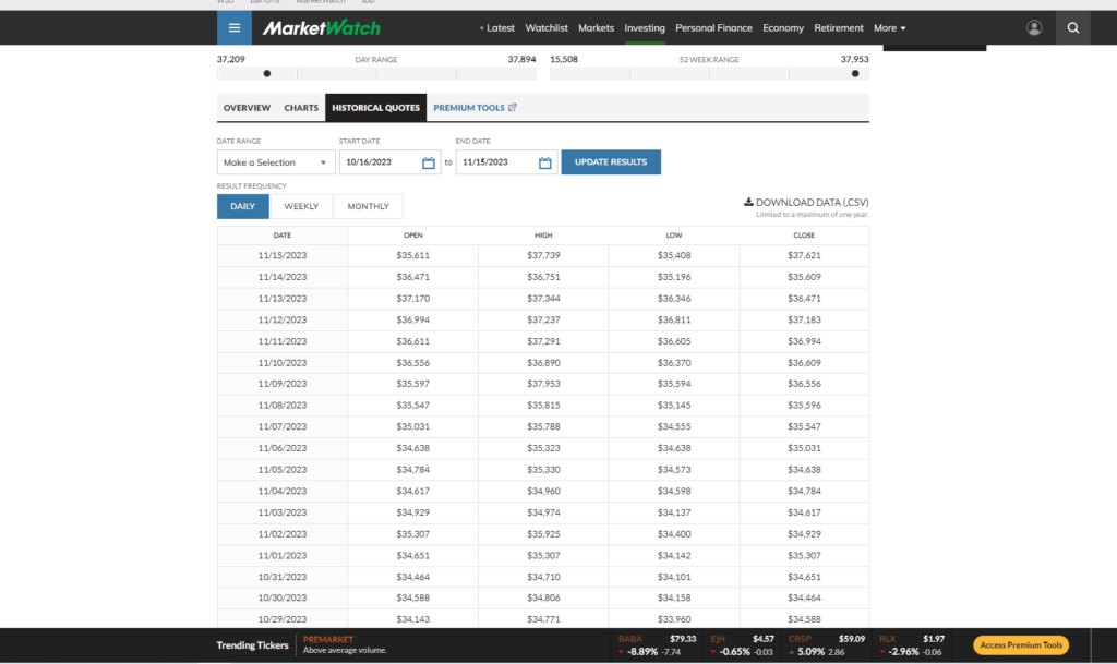
The first step for my project was to find a database or a csv file that contains historical BTC/USD data from 2008 (when bitcoin was created) to the current date (16.11.2023). This ended up being more difficult as I first expected as it is hard to find data for before 2013. A common issue was that I found a lot of graphs that weren’t able to be exported in csv form. I thought this will be possible easily on either Tradingview, Kaggle or Coinmarketcap, but unfortunately that was not the case.
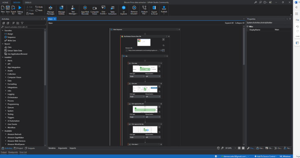
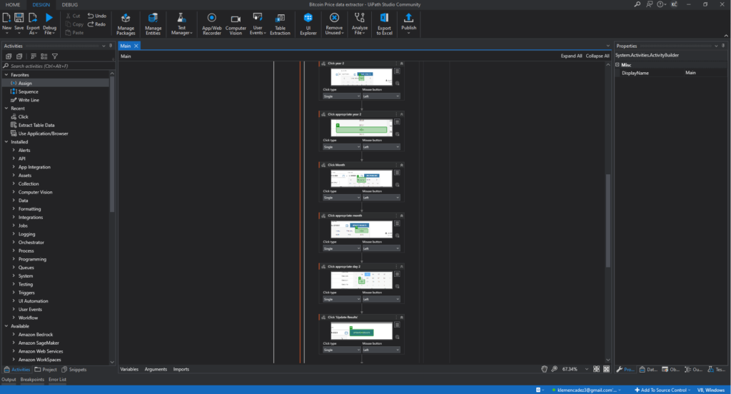
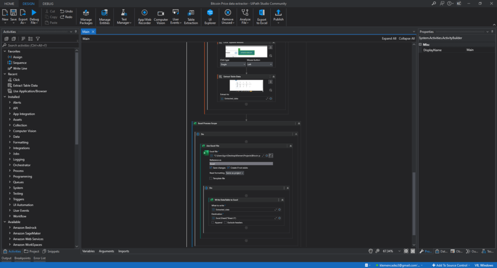
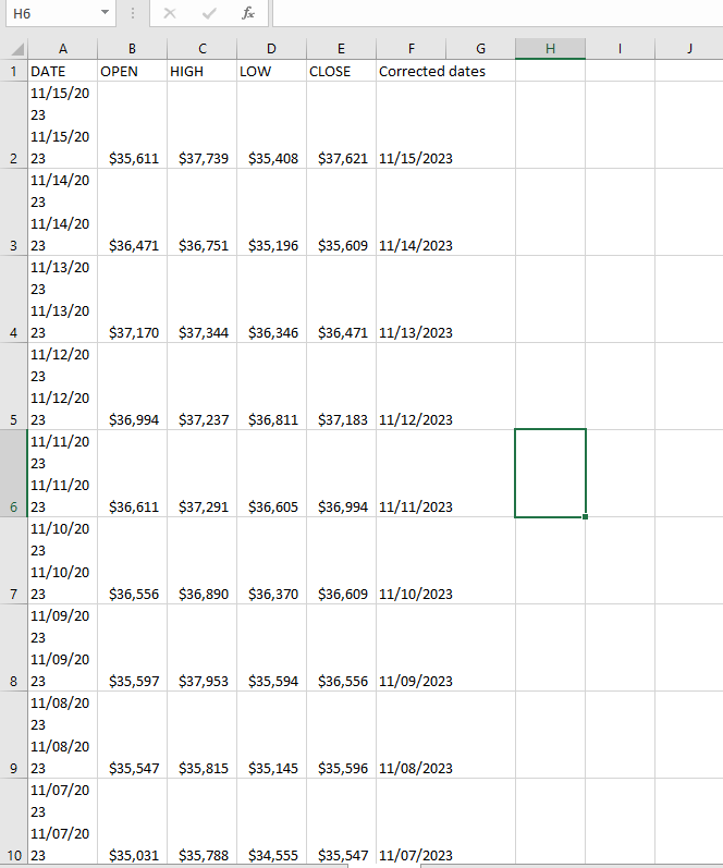
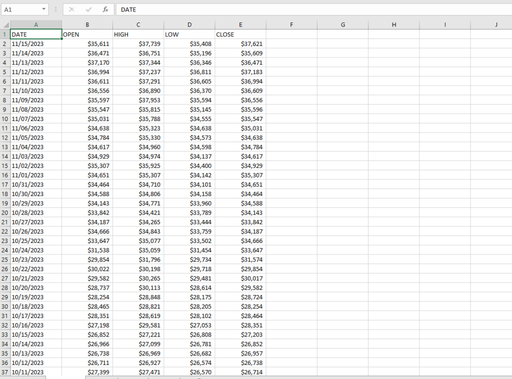
I did find what I was looking for on https://www.marketwatch.com/, but this also had its obstacle. The data was not able to be downloaded as csv as a whole but it was limited to 1 year. So to collect this data I created a bot using UiPath to scrape the data page by page for each day for 13 years. Once the data was collected the bot wrote it into an excel file.
After a bit of formatting to correct a few unnecessary steps that the bot made I got all the data I will need to do my analysis.
2.
After that I imported my Excel file into Power BI and formatted the columns into their proper format (currency and date) and since the Uipath bot needed to collect the data into 3 seperate tables I had to join them together using power query. After that I created my first dashboard.
Before starting the dashboard I needed to get the dates of the bitcoin halving as they will be very important for my analysis.
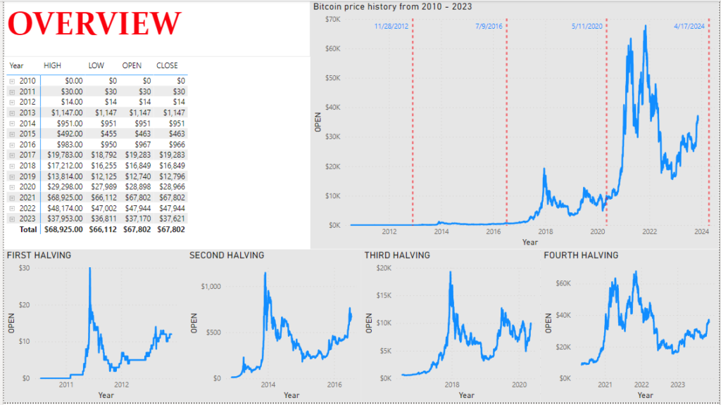
The first dashboard represents all the data that I have collected.
- LINE CHART 1: represents the whole price history of bitcoin by day from 2010 – 2023. It also includes constant lines on the chart that represent the dates of bitcoin halvings.
- 4 LINE CHARTS: the line charts at the bottom represent BTC/USD prices between each Bitcoin halving.
- MATRIX: I also included a matrix visual where anyone can check the open, close, high or low of the bitcoin price on any specific day in the collected data or the maximum it reached in the month or year.
When just looking at this page with the graphs of all the halvings at the bottom, there do seem to be similarities in the price movements between halvings. There does appear to be a bullish trend starting right after each halving.
3.
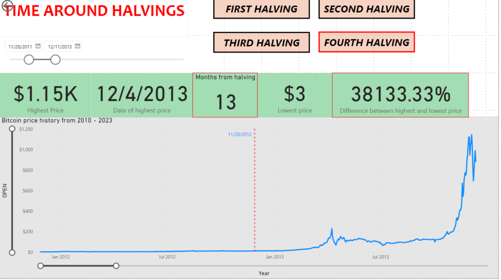
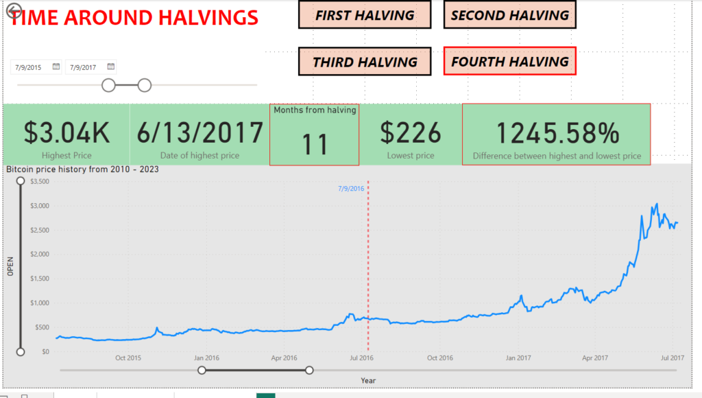
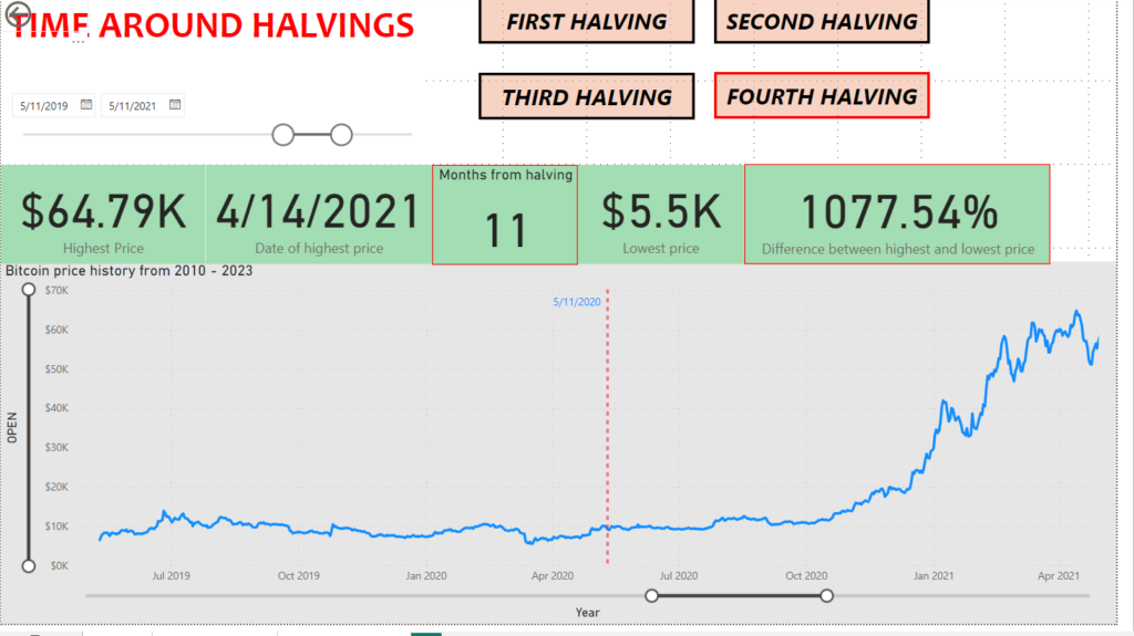
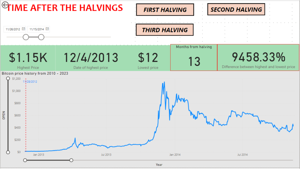
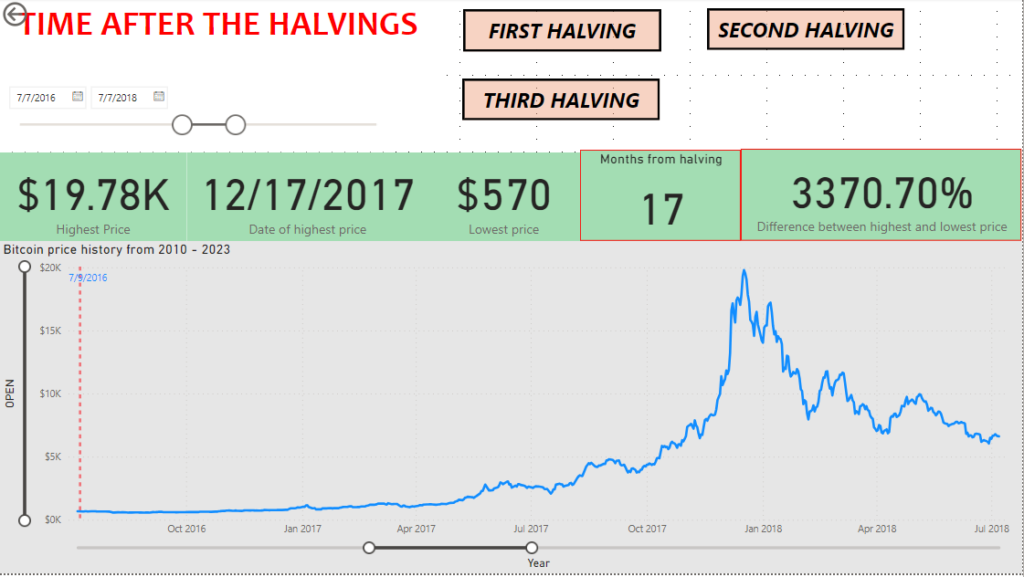
In the second dashboard I made it possible to analyze the price movements around the halvings. So 1 year before and after each halving to see price changes leading up to the bitcoin halving and the time after.
I also created buttons that adjust the dashboard to the proper time depending on the halving you choose to check. I also added card visuals representing the peak price in that time period, the date of the highest price and the months between the halving and the new peak price. I later also decided to add the % difference between the lowest price and the highest price, as it does seem like an important piece of data here.
The only outlier here is the fourth halving, since it didn’t occur yet, so it only shows the years leading up to it.
There is definetly a bullish pattern following each bitcoin halving so far. There was a new all time high reached every single time following the 12 months after each halving.
Another piece of information we can see from this dashboard is that the % difference between lowest and highest prices in these periods are getting smaller with each halving, which tells us that the price is becoming less volatile through the years.
4.
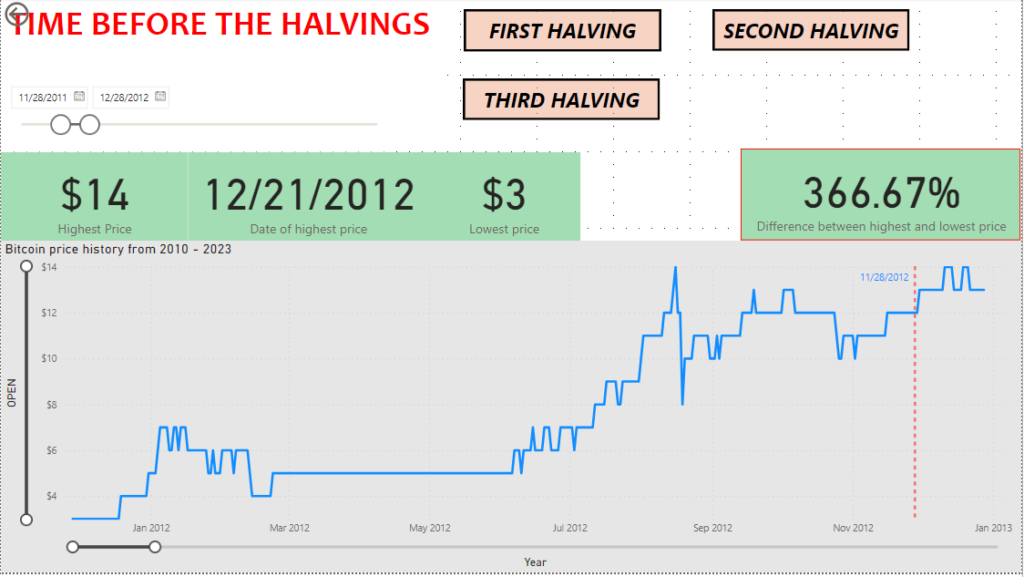
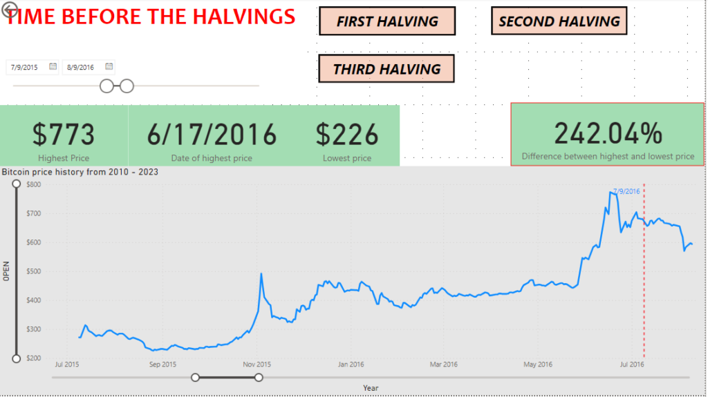
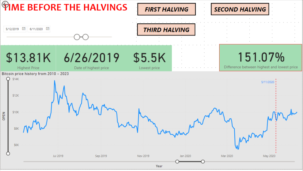
Next I created a dashboard that only observes 1 year leading up to the halving to see if there is any clear patterns or similarities to take advantage as a investor/trader.
I used the same dashboard as before, with minor changes and I set the halving buttons to different times (1 year before the halving).
I did not find anything very significant or any clear patterns while observing these charts. You could say there is a bit of a bullish trend usually in the months right before the halvings, something that maybe experienced day traders could take advantage of.
Something I did notice was that the volatility in these times has also decreased through the years if you look at the differences between the highest and lowest price.
5.
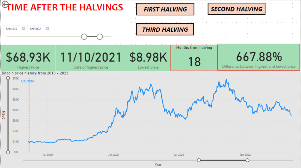
After that I created my final dashboard where I analyzed the 2 years following each Bitcoin halving. I did it in a similar way as I did the previous 2 dashboards where you can jump through the halving times using the buttons and you will see in the visuals the highest price that was reached in that time, the months that passed between the last halving and the highest price, the lowest price, the % difference between lowest and highest price and the date of the highest price.
There does seem to be a difference between the data from the second and last dashboard. So while looking at only one year after the halvings, the peak price was reached 11 – 13 months after the halving had occurred, but the second and third halving both reached new peaks about half a year later.
The third time the new peak wasn’t much higher that the prior one, but the second time it was pretty significant, being about 6 times higher.
So this leads me to the conclusion that the articles written on this topic are surely presenting some valid data, since there definitely are some similarities between price action in the times after the Bitcoin halvings.
Something that is quite clear is that the price volatility is getting lower and lower through the years, that is visible on all the dashboards.
The price does seem to reach new highs following each halving, but there is no way to really know when the peak will occur. Typically a new high was reached within 10 months following the halving (before the actual peak), but that doesn’t mean the price will not go higher, so finding the perfect moment of when to sell for maximum profit is of course very unlikely.
Looking at this analysis, investing into bitcoin leading up to the halving and a short time after does seem like a good strategy that is likely to be profitable, but we need to keep in mind that just because this happened before, doesn’t mean it will happen again. Looking at only 3 points in history is not really much to go on and there are plenty of other factors we need to consider when investing in bitcoin.
For new and inexperienced investors/traders I would recommend investing in the times around bitcoin halvings with the intention of selling at a price decided in advance.
For more experienced traders these times do show a lot of volatility and can reap great rewards with a well placed strategy.

